Coon Rapids, Minnesota – The year is 2006, and, unbeknownst to the world at large, some of the world’s greatest artists, calligraphers, and printers have come together to discuss what would become one of the greatest artistic and technological endeavors of the new millennium: reproducing 299 full-scale, true-to-form renditions of The Saint John’s Bible, to be named the Heritage Editions.
The Saint John’s Bible is a work of art and a work of theology. A team of artists coordinated by Donald Jackson in Wales and a team of scholars in Central Minnesota have brought together the ancient techniques of calligraphy and illumination with an ecumenical Christian approach to the Bible rooted in Benedictine spirituality. The result is a living document and a monumental achievement: the first and only hand-written, illuminated Bible crafted since the invention of the printing press in the year 1440.
To sit with, touch, and reflect on an illumination in one’s own community offers a very different sensory and spiritual experience from traveling to view the original manuscript one time, or even from viewing the work digitally. The tactile and visual experience of the work in real life can be profound, allowing seekers to step into an illumination’s dimension, experience the movement of light across the page, and even see their very own faces reflected in the carefully placed gold foil, which represents a divine presence in the Bible.
Though the tactful preservation of the original work was (and remains) of the utmost importance, The Saint John’s Bible was crafted under the vision that it would be shared far beyond its safe confines in the Hill Manuscript Museum and Library on the Saint John’s University campus – with the full and uncompromising ability to ignite the spiritual imagination of diverse communities across the world. The artists, creatives, and production specialists knew they wanted people around the world to not only see the pages of the Bible but to experience it in its full magnitude.
These professionals included experts at Monadnock Paper Mills, McIntosh Embossing, Roswell Book Binding, Frost Custom Jewelry, and, for the recreation of the pages themselves, The John Roberts Company (see the full list of professionals who worked to create The Saint John’s Bible, here.) The project was entirely overseen by Donald Jackson, the creative director and principal scribe for The Saint John’s Bible, and former principal scribe to Her Majesty Queen Elizabeth II. Assembling a team of artists and scribes of this caliber is almost unheard of in the modern era.
“In most scenarios, the printer works with a publisher and not the artist directly. In this case, Donald himself invested his time and his talents with each one of us individually even as well as our partner vendors, which is just absolutely rare,” said Mike Nordberg, senior account executive at The John Roberts Company, the printing company responsible for this immense task. “Without this, the vision and the spirit of the original would’ve simply been lost. Donald Jackson was a catalyst for greatness from the beginning to the very end. In this case, it was one of those monumental projects, the research and testing started in 2004 and we completed Letters and Revelations in 2012. It’s a sizable amount of time span that was covered, and still to this very day, I’m continually blessed by his friendship along with the friendship of the many other team members that were able to make this dream team and pull this whole thing off.”
These production artists knew that if they were going to undertake this project, they must not only do justice to the original work but pay deep reverence to it. Looking ahead at the near decade of work unfolding before them, the collaborators kept one thing at the core of their work: attention to detail. Because for a work of art of this caliber, traditional printing just wasn’t going to cut it.
“We [the team at The John Roberts Company] were given this really once-in-a-lifetime project that would involve high-quality printing, but we realized very early on that it would take more than just high-quality printing to make this fly,” said Nordberg. “It would really necessitate a team or collaboration of industry experts. The expertise and the attention to detail were of the utmost desire.”
Building the Bones on Which the Art Would Live
The process began with deciding which paper would serve as the physical slate on which the soul of the work could flourish. The original work was completed on calfskin vellum, an incredible, high-quality parchment that boasts marks of a calf’s biology as well as a translucent quality. The scribes accounted for the transparency by designing every illumination and script in the context of the pages surrounding it, meaning ink bleeding through any given page would only contribute to the art on the opposite side of the vellum.
“The two-sided nature of it was certainly the challenge, but it also gives you the beauty of the bleeding of inks on the back,” said Nordberg. “Looking at some of these illuminations, to me it’s just gorgeous because it’s certainly not a bunch of outlined illuminations against a standard stark white background. Rather, you get this ambiance – an experience — which is of course what the original has, and which posed a great challenge to replicate.”
Striving to capture the magic of the original, the team laid out their options. They considered utilizing translucent vellum paper, however, simply put, it feels like plastic. The experts then considered a vellum finish paper, which has the desired subtle eggshell feel; however, it’s opaque and typically prints in a sponge-like fashion, meaning significant detail would be lost. The question became – how do you get a high-quality translucent paper with a smooth vellum-like finish? With that being said, Dave Peterson, Donald Jackson, and Nordberg decided that one hundred percent Monadnock paper was the way to go.
Monadnock paper is made of acid-free, archival cotton. Perhaps most importantly, this elegant paper type is projected to last more than 1,000 years. During its life, it does not become yellow or break down in nature. This means that future humans who experience the work in the year 3000 will be welcomed with the very same visual that seekers experience today, a dream that heavily inspired the creation of the Heritage Editions. With that, the bones of the project were decided upon.
“It’s literally what was possible during our time period when we did this. Historians of course — they’ll love it — because everything that you see today, even most art prints, they’re not done with even light fast inks, let alone the substrate that they’re on is not that quality. It’s going to change,” said Nordberg. “Hundreds of years from now, that art print that you truly love and enjoy, your grandchildren are going to see the same color that you see today. Nothing was overlooked in this process. It was literally hours and hours and meetings and decisions on what was going to be done. And what we ended up with was basically a bulletproof set of books, I would argue.”
Beyond Tradition: Printing Techniques of the 21st Century Bring Traditional Manuscript Techniques to a Modern Audience
With the paper decided upon, the real challenge began. How does one go about replicating the intricate script and illuminations that were meticulously drawn onto The Saint John’s Bible by a team of the greatest scribes alive on the planet?
“There are many different ways this could have been printed, silk screen and thermography being two examples. But what Dave Peterson really seeded was this idea or notion that we’re going to go above and beyond traditional printing,” said Nordberg.
Traditional printing would mean utilizing the industry-standard 150 or 175-line screen (lines per inch). Given the incredible detail of the work and the nature of how the scribe’s goose quill (used to craft the original work) was swept and released over the page, the industry-standard line screen would have led to broken text and unavoidable pitfalls in replication.
“We knew it would have to be much more than that. It would have to be something where we, John Roberts with Heidelberg, would need to make a connection here of trying to do something that’s really worthy of this significant project,” said Nordberg.
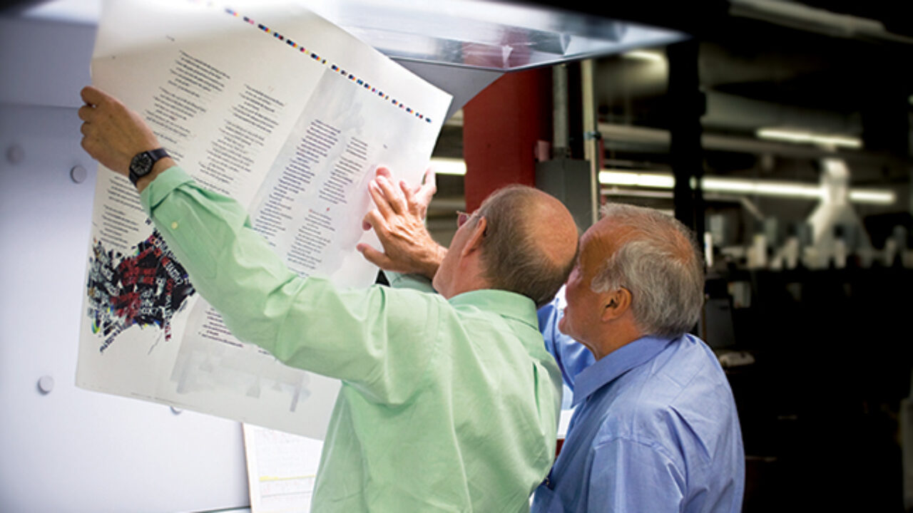
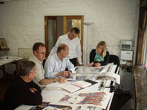
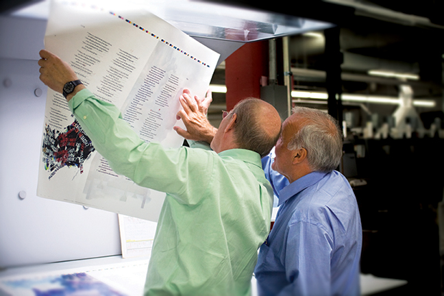
With this in mind, the team moved forward with intense testing periods. Under Jackson’s direction, specialists proceeded to meticulously analyze the original illuminations to begin the color-matching process.
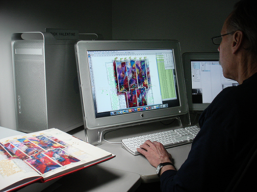
“We went back to the originals, and we had to, as a company, invest in a full server just to have this volume at a time on our pre-press department. But the size of these files, from the calf follicles to Sarah Harris not erasing a pencil mark here and there, everything became alive,” said Nordberg. “There were aspects of character that even the artists themselves were like, ‘Is that really on there?’ You bet it is. We received these ginormous raw files, then we would convert them to typically a minimum of six-color.”
“We special mix the colors and, of course, the material that the ink sits on will affect the final color of the ink. So, we did ink draws on the real cotton paper. We’re seeing and approving them before we hit press to make certain that it complements the original on the actual calfskin,” said Nordberg. “Even though it’s two-sided, it may have three or four different Pantone Matching System (PMS) colors or shall we say, special mix colors in this case, which is very rare.”
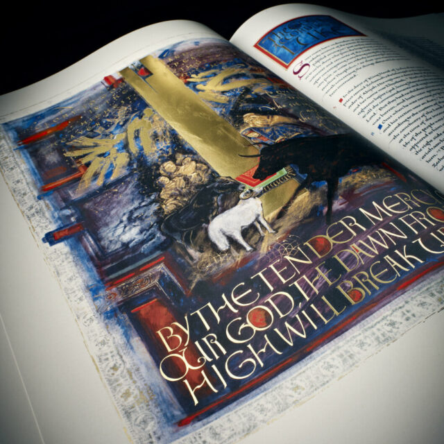
After significant testing and color matching, the printers decided to utilize high-quality 10-micron stochastic hybrid printing with fade-resistant ultraviolet inks, special mixed colors, and silver and gold foils. Try with all of your might to find a Pantone color match, you will be unsuccessful. These colors are entirely unique and matched to perfection. The final result is detail equivalent to 500 line screen.
“Even down to the script in black, we used four-color black ink, which allows us to capture the full detail and dimension of the original black. When black ink hits a cotton sheet, it truthfully turns gray. That means we have to rebuild the black color from scratch,” said Nordberg.
Rick Valentine, color specialist at The John Roberts Company spent countless hours on the volumes for every page. The script was four-color. The illuminations typically involved a touch plate black, even a fifth black in some cases, as well as a special mixed orange, yellow, green, or blue.
The printers gave special consideration to how the reflection of light plays into the overall beauty of the piece.
“Donald Jackson’s golds on the originals are just exquisite because he did a lot of silking by hand. When light hits it, no matter where you put it in a room or any type of light, it is instantly dimensional and intriguing,” said Nordberg. “We wanted to achieve the same thing with our process.”
To capture the magic of the original gold, McIntosh Embossing blended matte and true matte foil colors to create a luminous shine effect. When all was said and done, most illuminations throughout the piece are almost always eight or more layers, including inks and foils.
“The magnitude of the work needed to ignite this ‘wow factor’ that would do due diligence to the spirit of the project. This is how it needed to be done. It required a much different, much slower process,” said Nordberg.
The Most Sophisticated Tool Ever Created: Human Hands
It is true that no two Heritage Editions of The Saint John’s Bible are identical. This is because, in order to capture the magic of a hand-illuminated work, Donald Jackson and his apprentice, the brilliant Sarah Harris, hand-scratched gold foil into the work herself. It is virtually unheard of to hand-scratch a replication of a piece, but this team had one mission only: to create the most stunning, long-lasting replication of the original work possible. Every factor that had the potential to hinder this vision, from time, cost, complexity or otherwise, was more than worthy of overcoming for the sake of the project. Yet, another small bit of magic arose from Harris’ diligent work: the hand-drawn marks of a great artist, uniquely etched in all 299 Heritage Editions.
“We showed the gold and the silver foils specifically with overlays on top of the digital proof of the art. Donald would make changes on the digital overlays, then we would do anywhere from one to four tests using the actual foil. Then, we would send them directly to him to get approval on the technique that he thought would best replicate what he wanted. That was really the key,” said Nordberg. “Having the live artists oversee the process was an immense attribute to the project because Donald knows how he did the original. We have the tools and the puzzle pieces to really be successful because we have him here. That was such a joy and really made it a special piece that none of us will experience ever again.”
In the truest sense of the phrase, the making of the Heritage Editions was a labor of love. Hours were spent reviewing the digital proofs against the originals, with eyes glued to a computer screen and squinted at close inspection of the print proofs, turned into weeks, turned into years. But these eight years are only one small grain of sand when one looks ahead at the centuries-long legacy that the high-quality production of the work would provide.
“To us in the graphic arts, people always ask, ‘Wow, you really did that?’ Because it was a headache. It was one of those things that Tylenol couldn’t save,” said Nordberg. “Many of the people involved in this project who are dear to my heart, my father-in-law has passed away, and so has Brother Dietrich. Carol Marin handled the correspondence between Donald Jackson and Saint John’s during the process. She has since passed. There were so many people who were so important to this project, and there are so many good memories that I had with these people, and, now, their story is wrapped in this beautiful volume set, and that is really the joy of it all, right? It’s the fact that I can smile and cry, but there’s joy in my heart because these people are no longer with us, yet they set us on a path and a journey that you and now others can still experience today. It’s just remarkable. It really is.”
The Saint John’s Bible Heritage Edition: Igniting Spiritual Imagination Across the World
To read more stories similar to this one, visit the Heritage Edition blog or subscribe to the monthly e-newsletter, here.